There’s something absolutely magical about that moment when two fonts come together in perfect harmony.
You know the one – when your screen suddenly transforms into a canvas of pure typographic brilliance, and you just know you’ve struck gold.
I recently experienced this exact moment while working on a luxury winery mockup, pairing Coastal Grey with Mon Amie.
The combination was so stunning, it inspired me to break down my tried-and-true formula for creating font pairings that not only look gorgeous but actually convert.
Power Pairs That Convert
Coastal Grey + Mon Amie: Romance Meets Bold Sophistication
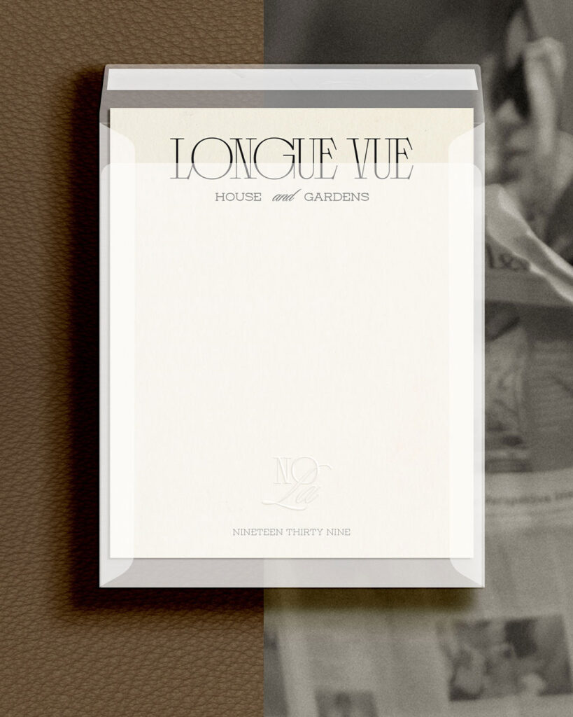
The elegant dance of Coastal Grey’s long serifs intertwining with Mon Amie’s confident slab personality. This combination isn’t just visually stunning – it’s strategic.
The contrast between edgy romance and beachy sophistication creates a perfect balance that works exceptionally well for:
- Upscale brands focusing on elegance and sophistication
- High-end community branding
- Luxury boutiques seeking to make a statement
What makes this pairing so effective is how Coastal Grey’s versatile personality provides the perfect foundation for Mon Amie’s bold presence.
Together, they create a visual narrative that speaks of luxury while maintaining approachability.
After Five + La Roue: The Evening’s Perfect Duo
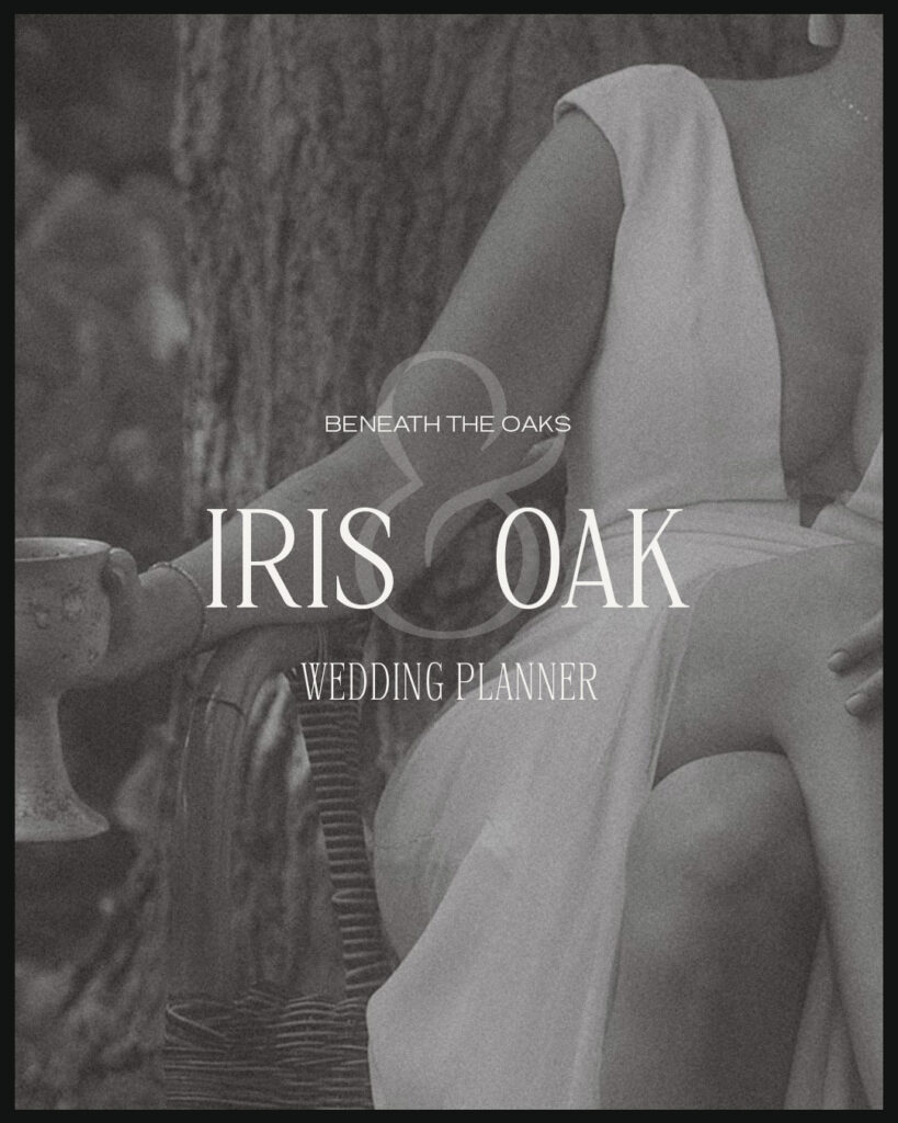
When After Five’s night-out-on-the-town vibe meets La Roue’s delicate tall presence, magic happens. This combination is particularly powerful for:
- Upscale event companies
- Modern art galleries
- Contemporary wedding brands
The contrast between After Five’s versatile weights and La Roue’s preponderant serifs creates a stunning visual rhythm that screams sophistication.
It’s like pairing a perfectly tailored black dress with statement jewelry – each element enhances the other’s best features.
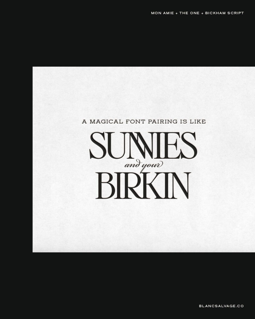
The One + Eleven Eleven: Editorial Excellence
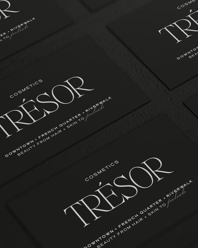
This combination is what editorial dreams are made of. The high contrast of The One paired with Eleven Eleven’s geometric perfection creates a typography power couple perfect for:
- Fashion magazines
- Beauty brands
- Lifestyle blogs
With The One’s impressive 5-weight range and Eleven Eleven’s modern edge, you’ve got a combination that can flex from super sophisticated to deliciously bold.
It’s like having a complete wardrobe of typography at your fingertips.
The Psychology of Font Pairing
Before we dive deeper into the technical aspects, let’s talk about why certain combinations work better than others from a psychological perspective.
Understanding this will transform how you approach typography in your brand designs.
Creating Emotional Connection
Different font styles trigger different emotional responses in your audience.
When pairing fonts, you’re essentially orchestrating these emotional triggers to create a cohesive brand experience:
- Serif fonts often convey tradition, reliability, and sophistication
- Sans-serif fonts communicate modernity, clarity, and straightforwardness
- Slab serifs project confidence, innovation, and strength
- Script fonts evoke elegance, creativity, and personal connection
The key is understanding how these emotional associations work together. For instance, pairing a strong serif with a delicate sans-serif can create a perfect balance between authority and approachability – exactly what many luxury brands aim for.
Advanced Pairing Techniques
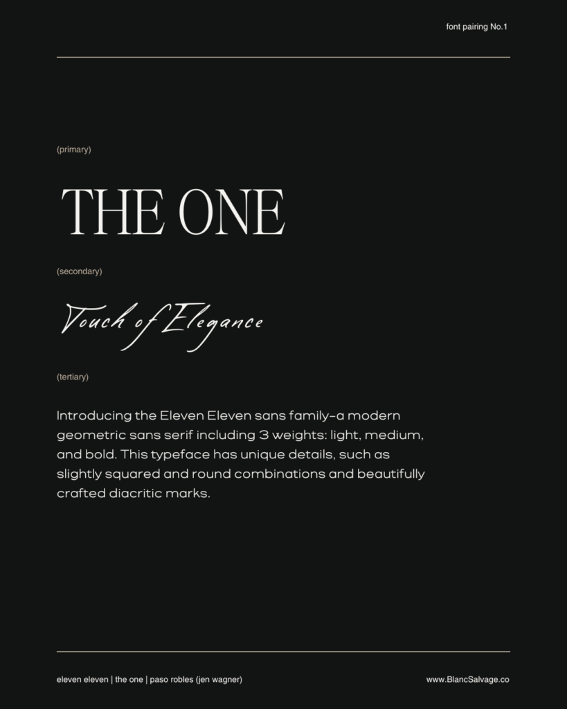
The Rule of Three
While we often talk about font pairs, don’t be afraid to work with three fonts when the project calls for it.
Here’s how to make it work:
- Primary Font: Your headline hero (usually the most distinctive)
- Secondary Font: Your supportive player (often used for subheadings)
- Tertiary Font: Your workhorse (clean, highly readable for body text)
The secret is maintaining clear hierarchy and ensuring each font has a distinct purpose in your design system.
Creating Contrast Through Scale
One often overlooked aspect of font pairing is scale relationships.
Try these techniques:
- Use dramatic size differences between paired fonts
- Experiment with weight variations within the same family
- Play with spacing and tracking to create visual interest
- Test different cap heights and x-heights for optimal harmony
The Science Behind Perfect Pairings
When it comes to creating font combinations that convert, there’s actually a method to the madness.
Here’s your quick reference guide for creating powerful typography combinations:
For Luxury Brands:
- Start with a high-contrast serif as your foundation
- Add a complementary font that enhances the luxe factor without competing
- Remember: sophistication lies in the subtle details
For Editorial Design:
- Mix weights within the same family
- Use clean lines to guide the eye
- Create clear hierarchy through size and weight variations
For Modern Minimal:
- Pair an ultra-thin weight with something bold
- Keep the san serif hits precise and intentional
- Let negative space do some of the heavy lifting
For Maximum Conversion:
- Use hierarchy to guide the eye to your CTA
- Ensure readability at all sizes
- Create contrast that captures attention
Common Pairing Pitfalls to Avoid
- Competing Personalities
- Don’t use two fonts with strong personalities
- Avoid pairing fonts that are too similar
- Watch out for conflicting historical contexts
- Readability Issues
- Test your combinations at various sizes!
- Ensure proper contrast for different applications
- Consider your audience’s reading environment
- Overcrowding
- Resist the urge to use too many fonts
- Maintain clear hierarchical relationships
- Give your typography room to breathe
Real-World Success
Don’t just take my word for it – let’s look at how these combinations work in the real world.
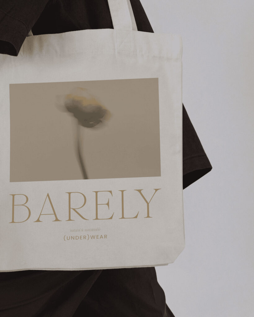
Yasmin at Y-Design recently shared her experience working with The One:
“I love using The One Serif because this modern serif font strikes the perfect balance between timeless elegance and contemporary style. Its precisely crafted forms combine classic serif elements with a clear, modern aesthetic that adds a unique sophistication and depth to any design. The One font is incredibly versatile, allowing me to infuse both minimalist and more opulent projects with a distinctive touch.”
Making Typography Work Across All Platforms
One crucial aspect of font pairing that often gets overlooked is how your combinations perform across different platforms and media. Here’s what to consider:
Digital Presence
- Test your pairings across different screen sizes
- Ensure loading times aren’t affected by font weights
- Consider fallback fonts that maintain your design integrity
Print Applications
- Check how your combinations look in different print sizes
- Test readability on various paper stocks
- Consider ink spread and printing methods
Brand Consistency
- Create clear guidelines for font usage for your clients
- Document specific size and weight combinations
- Provide examples of do’s and don’ts
Ready to Create Your Perfect Pair?
Typography is about creating an experience, telling a story, and guiding your audience through your brand narrative.
The right font pairing can elevate your design from good to unforgettable.
As a designer, I know you know this by heart:
The best font combinations are those that not only look beautiful together but serve your brand’s purpose and speak to your target audience.
Whether you’re designing for luxury, editorial, or modern minimal brands, the perfect pairing is out there waiting to be discovered.
Ready to transform your designs with perfect typography?
Read the Comments +