
")


Typography is like the ensemble your brand wears to the grand ball of the digital world. When done just right, it’s captivating and tells your story like nothing else.
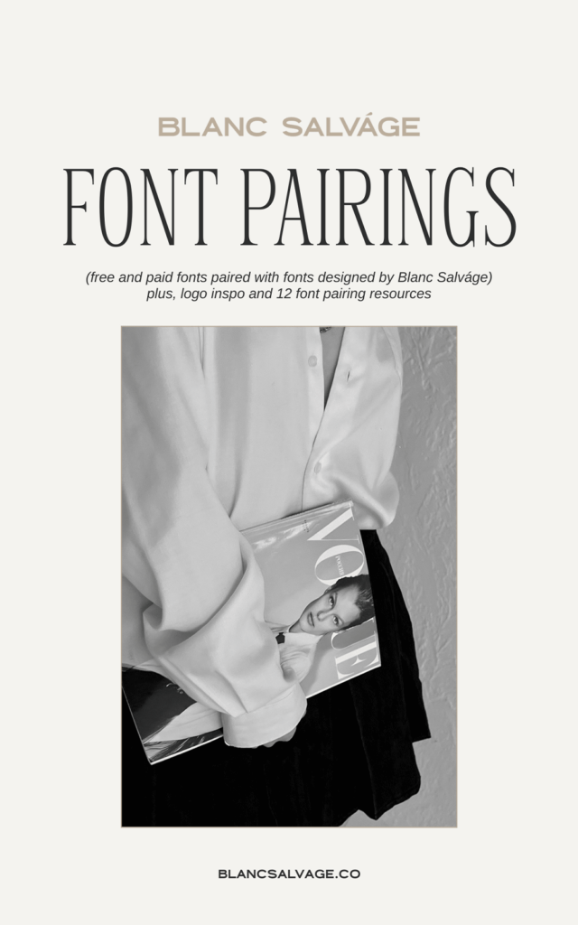
I’ve got 8 golden nuggets for you on the art of font pairing. And, as a little treat, I’m going to show you how my Blanc Salváge fonts tango together in headers, subheaders, and body copy.
Plus, I’ve sprinkled in a glimpse of these fonts taking the spotlight in logo designs, because real-world applications is the best kind of inspiration.
And because I believe in lifting each other up, there’s also a curated list of 12 go-to font pairing resources to have you styling and profiling in no time.
Whether you’re a seasoned pro or just beginning, by the end of this article, you’ll be moving through your designs with confidence and grace.
And hey, even if professional designer isn’t your official title — don’t sweat it! Some of these pairings were crafted in Canva, making them an effortlessly chic guide for anyone eager to let their brand sparkle.
8 Font Pairing Pearls of Wisdom, Straight from a Font Designer
Stick to three:
As a golden rule, try to stick to a trio of fonts per design at max. Simplicity is elegant., but also, limiting your design to three fonts ensures clarity and consistency.
For small businesses, brand recognition is key. When customers can easily identify your content amidst the noise, it strengthens your brand’s presence and trustworthiness.

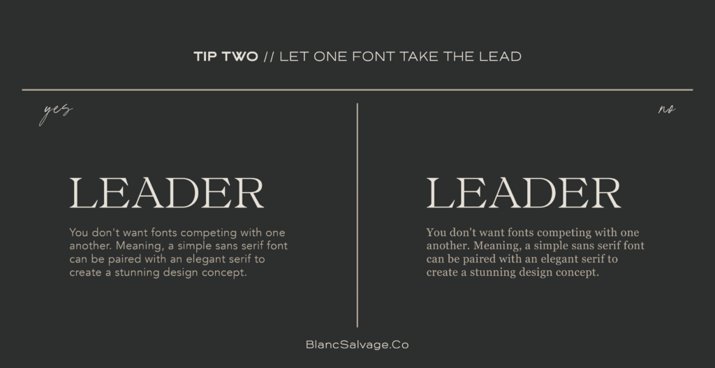
A lead and a support:
Let one font shine brightly and let the other gracefully set the stage.
Choosing a primary font with a supportive secondary ensures your brand’s message is the focal point. When a business’s values or offers are clear and uncompromised, it attracts and retains a loyal customer base.
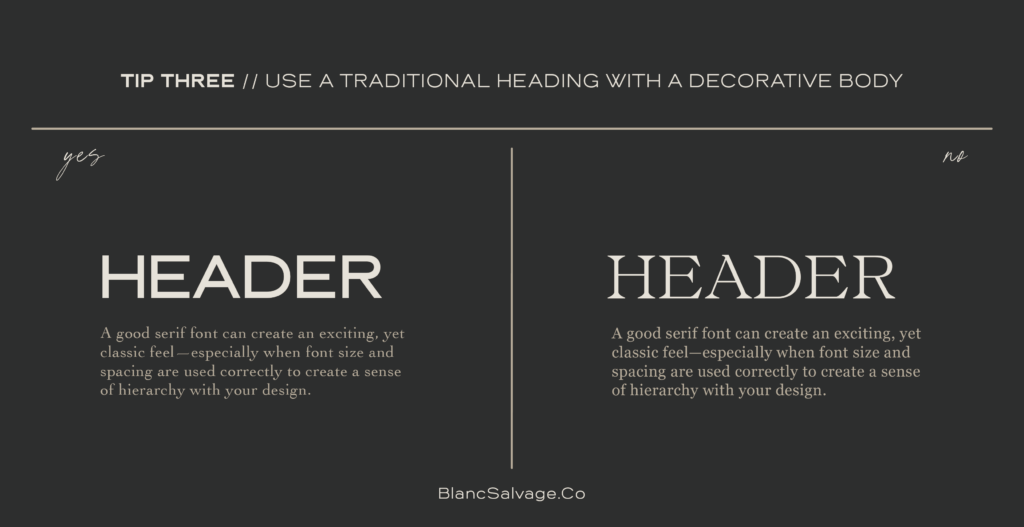
Classic Head, Decorative Heart:
A timeless serif header with a decorative body brings a touch of tradition intertwined with flair. The secret? Perfect size and spacing for that poised hierarchy.
Pairing a classic serif heading with a decorative body also offers versatility. This balance allows for both professionalism (think business proposals) and creativity (think promotional content) — crucial for small businesses wanting to appeal to diverse audiences.
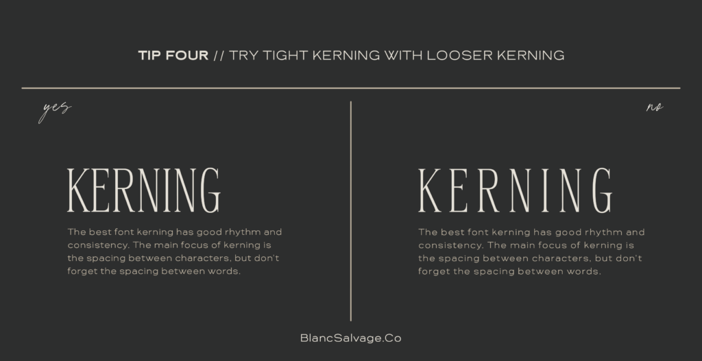
Mind your kerning:
Match tight kerning with its looser counterpart for a design that hums with consistency. Balance is key. While adjusting the space between letters, also consider the spacing between words for a consistent look.
Proper spacing not only enhances readability but also exudes professionalism. Small businesses often compete with larger entities, and attention to such details can set them apart, presenting them as meticulous and customer-centric.
Avoid Too-Similar Fonts:
If two fonts look like siblings, maybe they’re too close for comfort. Similar characteristics can muddy the message. Let each font have its own character.
Using diverse fonts ensures your content is both engaging and easily digestible. Clear communication of offers, values, or stories can be the difference between a sale and a pass.

Vary the Sizes:
Scale can be your design’s best friend. Picture a bold header font complemented by a petite body copy. This contrast carves out hierarchy and paves an inviting path for your readers.
Different font sizes emphasize importance, guiding the reader to what’s crucial. In business, guiding potential customers to calls-to-action or key selling points efficiently can be a game-changer.

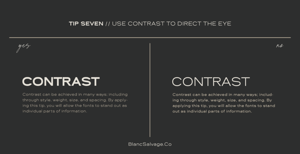
Contrast is key:
Direct the gaze using contrast—whether it’s in style, weight, size, or spacing. Such distinctions set distinct roles for fonts, letting each piece of information shine in its own light.
Contrast helps segment information, making it quicker to process. For branding, where every second a potential customer engages matters, making content accessible and compelling can greatly boost conversion rates.
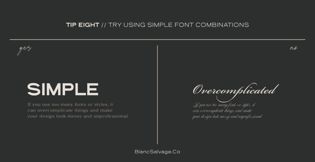
Simplicity Speaks Volumes:
When pairing fonts, embrace the beauty of minimalism. Overcrowding leads to chaos. Instead, gravitate toward classic, readable fonts.
A tip? Dive into the depths of a font family; they often harmonize right off the bat. Simplifying font choices avoids overwhelming your audience.
For us running a business, clarity in communication is essential. When customers understand what you’re offering without confusion, they’re more likely to trust and engage with your brand.
In branding, fonts aren’t just letters on a page. They’re powerful tools that shape perception, guide engagement, and can greatly influence a small business’s success. Here’s to making every letter count!
Font pairing logo inspiration
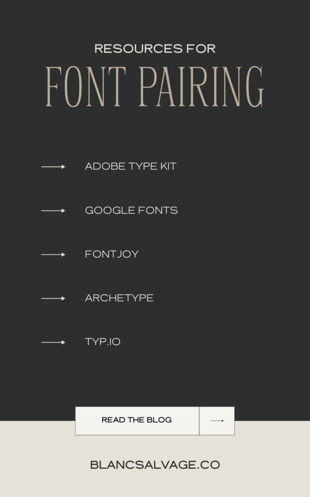
12 Resources You Need in Your Toolkit for Font Pairing Like a Pro
Navigating the world of font pairing, especially when you’re striving to capture the essence of a small business, can sometimes feel like searching for a needle in a haystack. But fret not! Just as every small business has its unique charm, there’s a font duo out there just waiting to make that brand pop.
Lucky for us, we’re not alone in this quest. There are many tools and websites designed to hold our hand through the process, ensuring we find that perfect match with less guesswork. Dive into these resources, and let them inspire and guide your next design adventure.
Remember, every font pairing you choose has the potential to elevate a small business’s brand, turning their story into a visual masterpiece
- Fonts In Use
- Adobe Type Kit
- Google Fonts
- Fontpair
- Fontjoy
- Typ.Io
- Monotype’s Font Pairing Generator
- Typotheque Font Combinator
- Google-Type By Femmebot
- Archetype App
- Typespiration
- Mixfont

Nurturing Your Creative Spark
Remember, each brand carries its unique heartbeat. Sometimes, to truly capture that essence, we need to tread uncharted waters. And you know what? That’s okay.
I encourage you, wholeheartedly, to play around. Dive into different font combinations, swim against the current, and let your creative instincts guide you. Sure, not every pairing will be a home run. But just like my unexpected success with the Krew pairing, some risks are worth taking.
After all, don’t our small businesses deserve a brand as unique and memorable as their story?
So, here’s your nudge: Challenge conventions, and most importantly, trust yourself. Because, babes, when you embrace the journey and dare to be different, that’s where magic happens!
Extra: Free Font Pairing Guide
Unleash the full potential of your brand’s visual identity with this Font Pairing Guide. Delve into a treasury of free and paid fonts, expertly matched with Blanc Salváge fonts. Unlock logo inspiration and gain access to 12 essential resources.
Add your name and email to subscribe and download this free guide.


Read the Comments +